Website Design
4 Website Features That Your Bank Should Use
It’s important for financial services to keep their websites in line with ever-changing landscape of digital resources and customer experience tools available. Simple integrations or optimizations can help boost engagement and create an overall better user experience. Here are four simple and effective features that banks, and credit unions can use on their websites that are beneficial to both the user and your financial institution as well.
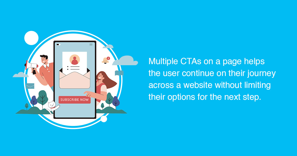
1. Multiple CTAs for Next Steps
Utilizing multiple CTAs on product pages can be extremely useful for the customer and for the bank itself from a data collection standpoint and improving on the user experience. Instead of just having one CTA button at the bottom of each page, give the user a few options to choose from as their next step. They may not be ready to [Apply Now], but they may be interested in talking to a lender, or seeing some more account options, or maybe reading a blog post or downloading a whitepaper to help them make their decision.
The Benefits:
- The customer journey continues – website visitors have multiple options for their next step.
- Clearer insight into what your website visitors are looking for.
- Opportunities to improve website user experience and provide better guidance.
Here is an example of how to incorporate multiple CTAs:
- Union Bank – Advantage Checking Account
This page details the offerings that come with opening an Advantage Checking Account- additionally, the user has the option to “Download a one-page overview on Advantage Checking”, “Compare Advantage Banking Checking Accounts”, or “Compare Deposit Accounts” if they would like to see the full suite of checking account offerings. This page also offers the user some Related Resources from their blog section with the topics of debit card benefits and how to use P2P payments.
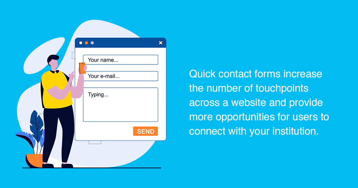
2. Quick Contact Forms on Every Product Page
Implementing short contact forms on the sidebar of key product pages like deposit accounts, loans, and investment services can help in many aspects. Quick contact forms help to catch the user in the moment of when they may have a question, giving them the opportunity to reach out right away before they get distracted having to click through two or three pages to the full contact form on the Contact Us page. This can also be a great lead-generation tool for banks and credit unions themselves. Being able to track and see what pages users were on when they filled out a quick contact form can provide advantageous insight into what other information may be helpful to include on that product page and give you some ideas for a new FAQs section or page.
The Benefits:
- Increased number of form submissions and leads captured – no need to click through to the Contact Us page.
- Inquiries can be easily directed to the right person or department depending on which page the form was completed on.
- Improved response times and better customer service overall.
Here are a few examples of how banks can successfully use quick contact forms:
- People’s Bank – Trust & Estate Planning, Quick Contact Form
A quick contact form is present on several product pages across the website. These short contact forms are easy to track as a CTA click and can be tracked individually on every page where it appears, so we can see how many submissions come from each page. - First Bankers Trust – Auto Loans, Quick Contact Form
This bank also uses a short contact form on several of its lending pages to get the lead process started with just a few simple entry fields. - Flatwater Bank – Business Loans, Quick Contact Form
A short contact form on a business or personal loans page can help increase the number of leads received without losing users to a long-form process.
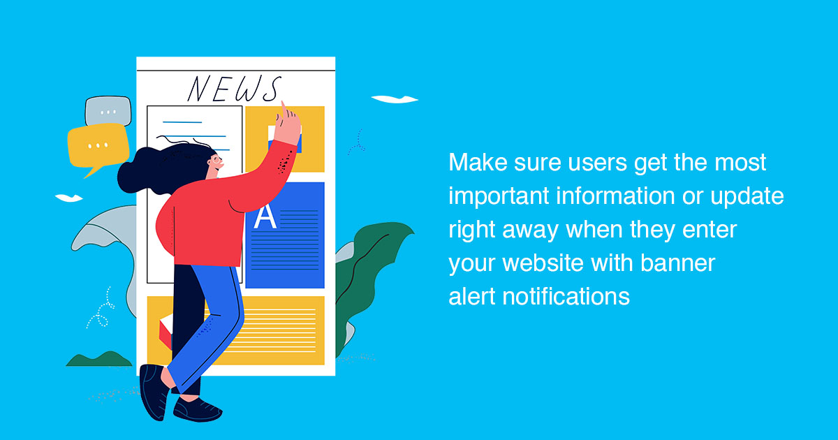
3. Banner Alerts and Notifications
Website banners have become increasingly popular over the last few years, especially during the height of COVID. Website banners are often featured at the top of the homepage, or within the main image carousel on the homepage, but can be displayed on any page of a website. For banks and financial institutions, website banners are commonly used to notify users of branch location closures or adjusted hours, planned website maintenance, or expected downtime to their online banking systems, pertinent information related to security breaches, or to encourage the user to download a mobile app or check out a new blog post.
The Benefits:
- Information is easily shared and available to any user who enters your website.
- Can be a helpful tool to boost conversion rates – encouraging users to download a mobile app, to open a new account, or sign up for a newsletter.
- Less intrusive than pop-up notifications and doesn’t interfere with the user experience.
Here are a few examples of websites that feature banner alerts and notifications:
- First South Financial Credit Union – Homepage Website Banner (Security notification)
- First National Bank & Trust Co. of Newtown – Homepage Website Banner (PPP Loans Update)
- First Bankers Trust Company – Homepage Website Banner (Holiday branch closure alert)
4. Live Chat or Chatbots
It’s well known that contact forms are essential for banks to have on their website because users need to be able to reach out for assistance when they need it. But what if the customer has a quick question that someone would be able to answer with just a few words? Often the turnaround time from when someone fills out a contact form to when they receive a response is anywhere between 24 to 48 hours on average. For someone who just needs to find out how to reset their online banking password, what time their nearest branch closes, or simply if they offer interest-checking accounts or not (or any other type of product), all these questions can be easily fielded by using a Live Chat or Chatbot tool on your website.
The Benefits:
- Improves customer service with instant support for quick customer inquiries.
- Eliminates overload of form submissions and helps improve response times.
- Offers website visitors another way to contact support if they do not want to or are unable to reach out for assistance through another method such as phone, email, or in-person.
Here are a few examples of financial websites that feature live chat or chatbots:
- Del Norte Credit Union – Glia Chatbot
- Bank of Washington – Glia Chatbot
- Lincoln Savings Bank – Five9 Chatbot

Ready to fine-tune your website and showcase these features? Reach out to BankBound for a Digital Analysis.
We focus exclusively on digital marketing solutions that grow local banks and credit unions. We understand your needs and the challenges you face as a bank marketer. We’ll work with you to formulate and implement an effective SEO strategy to attract more customers and expand your brand’s visibility online. If you’re ready to optimize your bank or credit unions website and improve conversion rates, request a no-pressure Digital Analysis, or talk with a strategist about your digital marketing plan today!