Search Engine Optimization
CTAs should be a part of your financial intuition’s overall SEO strategy, and if they’re not, you may be missing out on key details of the customer journey. CTAs are the key motivators that move users through your website from the first entry point to becoming a member or customer or opening a new account or applying for a new loan – all of which are ultimate goals of banks or credit unions. If you never really thought about the benefit of refining your Calls-to-Action, these best practices of CTAs for financial services will help you get started.
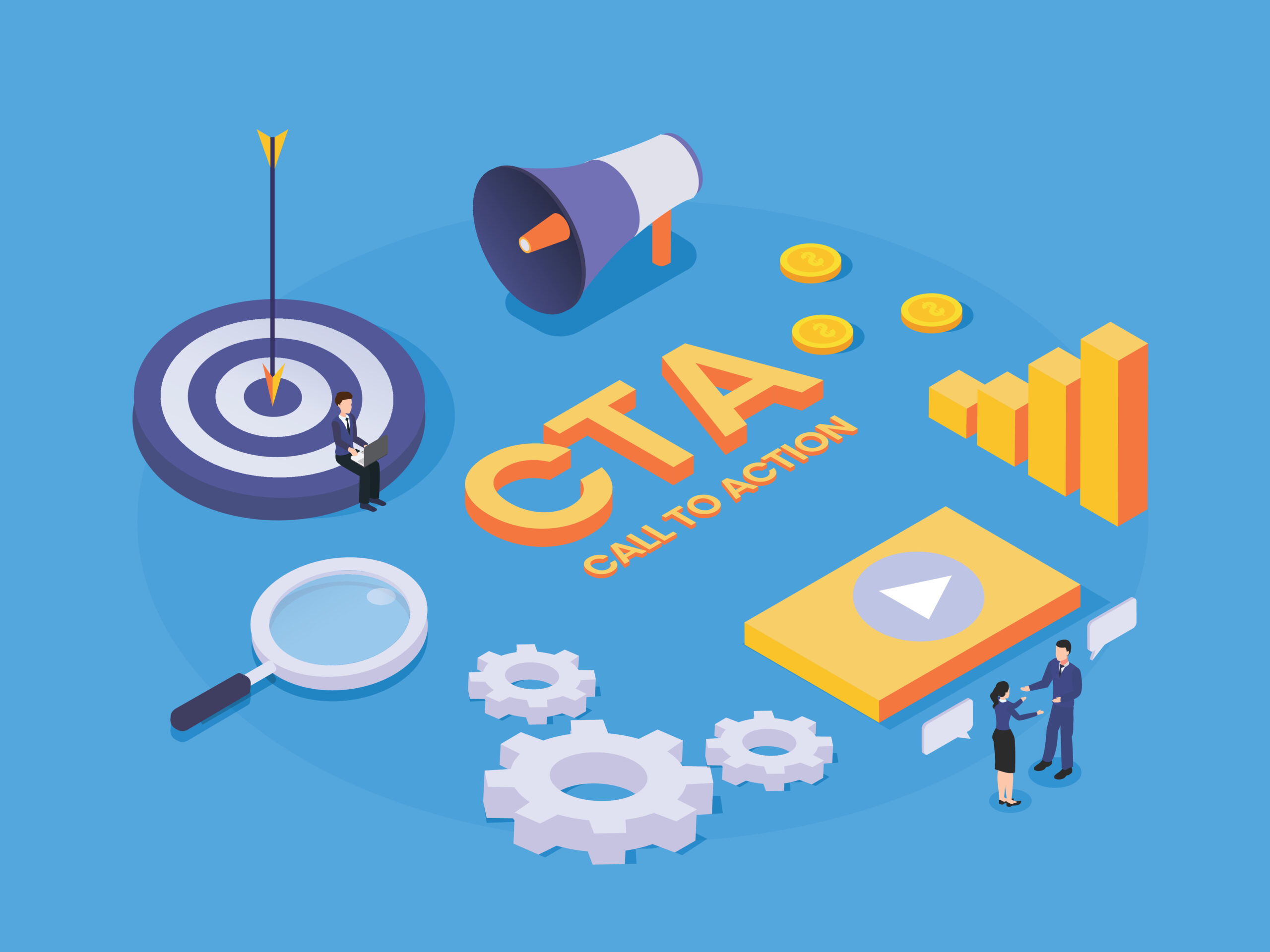
What is a Call-to-Action?
A Call-to-Action is typically a link or button accompanied by text or an image that instructs the user to take an additional step in interacting with your website. CTAs help guide the user through the website and assist them in determining which steps to take next. The ultimate goal and intent of CTAs are to drive users to become customers, boost engagement, and improve the overall conversion rate of website traffic. CTAs should be short and succinct, consisting of no more than five words, and provide clear instruction on what the user should do next.
For financial services, the most effective CTAs to utilize to achieve this end goal would encourage users to contact a lender, schedule a consultation, open an account online, visit a branch location, or submit a contact or application form.
Why Are CTAs Important to Have?
CTAs help banks determine how many of their website visitors are interested in a product or service or might be interested in the future. Incorporating CTAs into your bank website can provide more detailed insight into the user journey and help capture which website visitors could turn into converting leads. CTAs are important to have incorporated throughout your website because, without them, your website is just information. We want to provide the user with the appropriate amount of information on products and services to get them interested. Then we want to make sure we provide CTAs within that information, so the user knows what to do when they are ready to take the next step.
Simple CTAs on index or parent pages of [Learn More] or [Open an Account] help the user determine the next step to take when they’re moving through your site. Ideally, every financial services website would have an index page for each section (Personal Checking, Personal Savings, Mortgage Loans, etc.) where all individual sub-pages for products under that category would be shortly detailed and linked to with a CTA button of [Learn More] or similar. Doing this helps increase the number of Pages per Session, Average Session Duration Time, and Conversions/Conversion Rate for users, and traffic on your site as a whole.
What CTAs Should Be Included on a Bank’s Website?
- [OPEN AN ACCOUNT], [APPLY ONLINE], [COMPLETE THE APPLICATION] – New Account CTAs to direct users to an online account opening portal to open a new deposit or savings account or to apply for a credit card. Include on product pages for checking and savings, credit cards, and loans.
- [TALK TO A LENDER], [SCHEDULE A CONSULTATION] – Next-step inquiry CTAs to direct users to reach out to the institution by contacting a lender or representative via phone or email or scheduling an in-person or virtual meeting or consultation at a later date. These CTAs are meant to help users begin the process of obtaining a loan (personal, business, home, mortgage), or seeking out other wealth management and financial planning services. Include on product pages for all personal, business, and mortgage loans, as well as product pages for wealth management, financial planning, or estate planning services. Don’t forget to include [Contact a Lender] CTAs on “Meet Our Lenders” pages and [Call/Email an Expert Lender Now] on any individual lender bio pages.
- [LEARN MORE], [READ MORE] – Gathering additional information CTAs to direct users to continue reading details of a product or service or continue on to long-form blog content or resources. Use these types of CTAs on accordion pages that open up to display more information on products, on index pages and individual product pages, and on blog pages.
- [FOLLOW US], [SUBSCRIBE TO NEWSLETTER] – Interaction CTAs to direct users to follow your brand on social media or subscribe to a blog or newsletter. These directives help users continue to stay engaged with your bank after they’ve left the site.
Best Practices for CTAs
Choose Your Words Carefully
Using generic CTA’s like [Learn More] or [Get Started] work just fine. But appealing to the user with a benefit, urgency, or question in your CTA may help boost engagement and leads. If you’re offering a special interest rate on a savings account, using the CTA [Ready to Earn More?] or [Don’t Miss This Low-Rate!] will likely generate more clicks and engagement than a simple [Apply Today] CTA. Working in certain “benefit” type keywords into CTA text can be advantageous as well. Entice the user with directives that offer them the benefit of receiving something free, exclusive, limited, extra, or additional such as [Book a Complimentary Consultation], [Download the Free Whitepaper], or [Apply Today & Get $25].
Anticipate What the User Needs
Think about the user journey through your website and how a visitor would go from entering into the site to becoming a new customer or member. Using CTAs on high-traffic pages in addition to product and services pages can help guide the user through the website in the direction you want them to go, making it easier for them to know what the next step should be. After a user finishes reading through your interest checking account page, what do you want them to do? Include CTA buttons of “Ready to start earning more? [Open an Account]” or “Have questions about which mortgage loan is right for you? [Talk to a Lender].
Easy To Find
Make CTA buttons easy to locate on website pages, and easy to see. If you have a page with a lot of copy that is on the longer side, it would be beneficial to include CTA buttons at both the bottom of the page as well as at the start of the page. With pages of longer copy, often times users will not even make it all the way to the bottom of the page and miss the CTA button entirely. That’s why including CTA buttons at the start and bottom of product pages can be helpful in making sure as many users see them as possible.
Easy to See
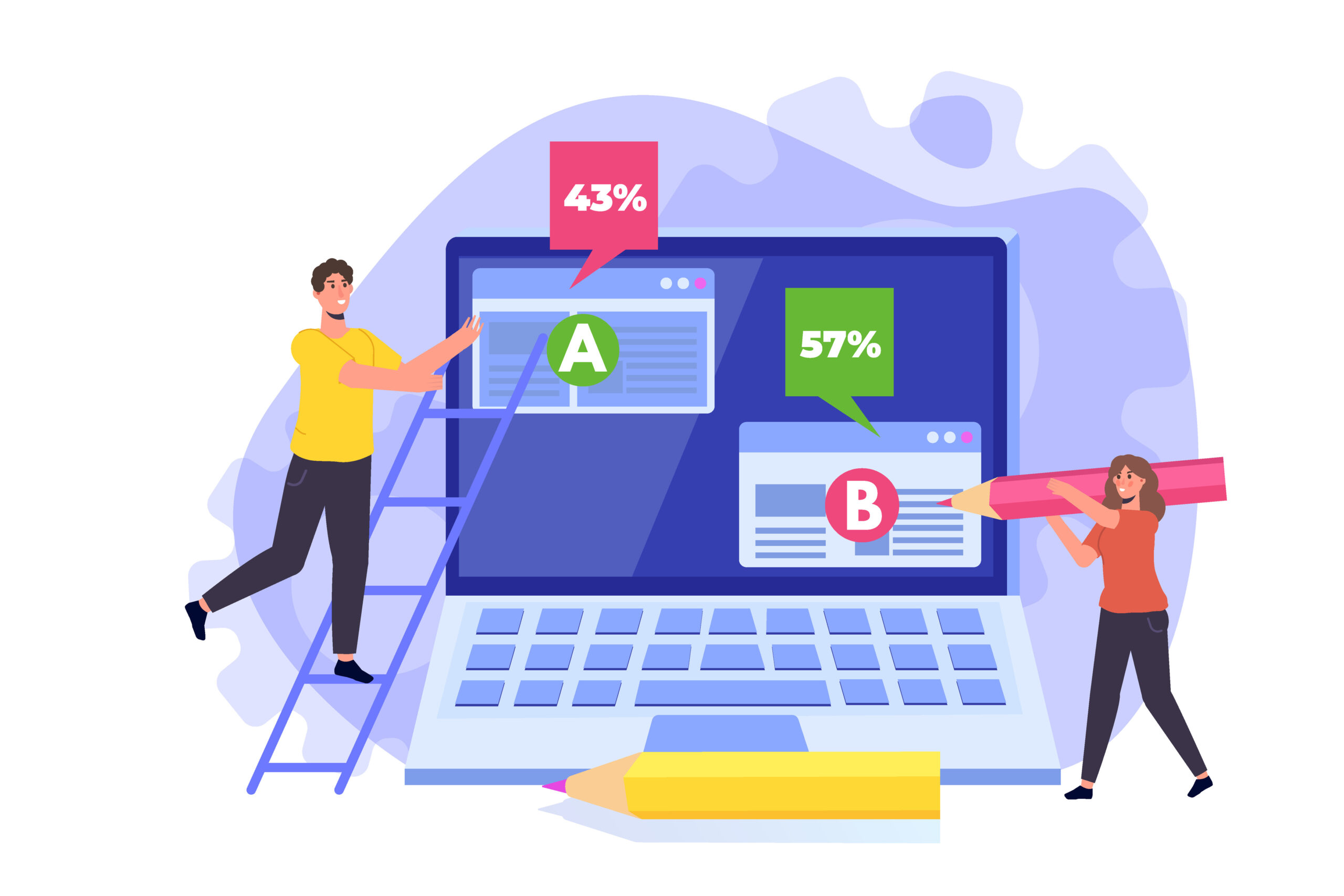
Button color often plays a major role in the successful performance of a CTA button. Make sure CTA buttons are prominent and eye-catching; they should be noticeable as the user is quickly scrolling through the page. Avoid using button colors that blend in with the website background color and get lost in the mix. Use an attention-grabbing shade with a contrasting color for the CTA text so it pops and is easily readable. Visibility and click action may be further benefitted by carrying out an A/B test on different versions of buttons with varying button color, text color, text wording, button size, etc. to see which would perform best on-site.
Test, Test, and Test Again
Once you have CTAs in place, you should be continually testing and refining your Calls-to-Action to achieve optimal performance and conversion rates. This could include experimenting with button color, size, or placement, swapping out CTA text, or altering landing page design. Even if your CTAs are performing well for a time, it’s always beneficial to test out new variations to see if you are able to further boost engagement. And of course, if a CTA isn’t delivering the results you want, test out different variations until you start seeing the engagement levels that you were aiming for.
Ready to optimize your CTAs and engagement?
BankBound can help you with an SEO strategy.
We focus exclusively on digital marketing solutions that grow local banks and credit unions. We understand your needs and the challenges you face as a bank marketer. We’ll work with you to formulate and implement an effective SEO strategy, whether it be bank or credit union SEO, to attract more customers and expand your brand’s visibility online. If you’re ready to reach new customers and improve website conversion rates, request a no-pressure consultation or talk with a strategist about your digital marketing plan today!